
 01 201 8700
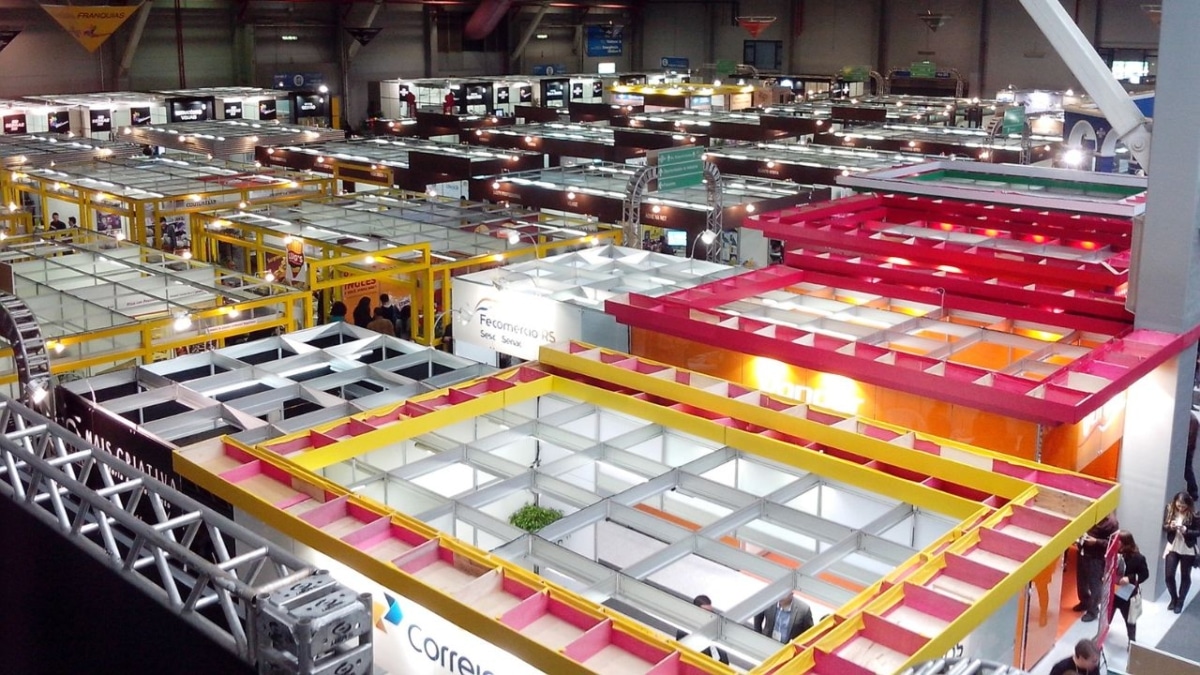
Exhibition Branding Consistency Guide: How to Create a Unified Brand Experience That Gets Results
Exhibition branding consistency means your logo, colours, typefaces and message look and read the same on every piece of your stand and at every event. A visitor should recognise you straight away, whether they last saw you at a conference in Dublin, a trade show at the RDS or a festival in a field in Kerry.
For Irish businesses that exhibit several times a year, getting there is about process more than design talent: one set of guidelines, one set of master files, the same colour references for every material, and a check before each show. In more than 20 years of printing exhibition kit, we've found the stands that stay on brand are the ones run on a simple system.
Why consistent branding matters on an exhibition floor
Visitors walk the aisles quickly and decide in a moment which stands they recognise, understand and trust enough to stop at. If your backdrop, banners and counter all carry the same logo, colours and headline, you get that moment of recognition. If they don't, you're asking a busy person to work out who you are.
A disjointed stand also costs you trust. Two slightly different blues side by side, or an old logo on a pull-up banner beside the new one on the back wall, tells buyers this business isn't on top of the detail, even if they couldn't say what looked off.
Consistency doesn't mean every item is identical. Your back wall carries the logo and main proposition, a pull-up banner might carry one product and a call to action, and a tablecloth might carry only the logo. Each does a different job, but all of them should clearly come from the same family. Over a season of shows, that builds the familiarity that turns a stand visit into an enquiry. Our post on why branding matters for your business makes the wider case.
How the same artwork changes from one material to another
A common consistency problem isn't a design mistake at all. It's one file printed on different materials and coming out looking different, because glossy PVC, matt fabric, translucent flag fabric and a backlit lightbox all handle colour in their own way, and hall lighting changes things again.
| Material | What can shift | What to do |
|---|---|---|
| PVC banners | Laminated PVC has a smooth, glossy finish that can pick up glare under hall lights. | Use the same Pantone and CMYK references as your fabric pieces. |
| Pull-up banners such as the Economy Roller Banner | RGB files drift from the colours you saw on screen. | Supply artwork in CMYK, not RGB. |
| Tension fabric display stands | Graphics are dye-sublimated into polyester, a matt finish that reads softer than gloss. | Judge fabric against PVC under similar light, not against your monitor. |
| Corporate flags | The fabric is 95% translucent, so daylight shines through, and the design shows as a mirror image on the reverse. | Ask for a proof for critical brand colours. |
| Backlit lightboxes | Colours look more saturated when backlit; gradients and rich blacks need careful handling. | Proof it expecting it to look brighter than the pieces beside it. |
| Oversized tablecloths | Ordered separately, a tablecloth can look a shade off beside the backdrop. | We match to your Pantone or CMYK values; order it with the rest of the stand. |
In practice: give us the same colour references for every piece, supply CMYK files, approve proofs, and judge colours against each other rather than against a screen, which works in RGB and won't match any print material exactly. Wherever you can, order the set together. When the rectangle banner flags outside and the pull-up banners inside are produced at the same time, we can keep your brand colours consistent across the full set.
Test one thing early: exhibition lighting can make a deep navy read as black from a few metres away. If your palette leans dark, look at a proof under strong light before signing off the stand.
Every touchpoint should follow the same brand system
Your stand is only one stop in the visitor's journey. Before the show they see your emails and social posts; in the hall, your signs, back wall, counter and staff; afterwards, a QR code, your website and a follow-up email. All of it should look and sound like the same company.
Agree one primary message for the event, two or three supporting points and one call to action. A 3m backdrop can carry the headline and a proof point, a promotional demo counter the logo and call to action, and your landing page the detail. The amount of copy changes; the proposition doesn't. Anything you hand out should follow the same guidelines.
The same goes for digital. If your stand says "Book a demo", the QR code should open a page that says the same thing in the same colours, not your homepage, and social posts should use the stand artwork so people recognise it in the hall. For what goes where on the stand itself, see our post on branding banners and exhibition stands.
Add an exhibition section to your brand guidelines
Many brand guidelines were written for screens and documents, not a 3m wall seen from across an aisle. We'd add a short exhibition section covering:
- Logo versions for dark and light backgrounds, with clear space and minimum size, and no stretching, recolouring or effects.
- Colour references in both Pantone and CMYK for every brand colour.
- Approved typefaces and minimum text sizes for reading distance.
- Approved photography and image style, supplied as high-resolution files.
- The message hierarchy: headline, supporting points and call to action.
- Master artwork files with clear names and one current version, stored where everyone can find them.
- Who approves artwork, and how quickly.
Test your typography at distance before it goes to print. An elegant serif that works in a board presentation can turn to squiggles from two metres away in a busy hall. Print a section at full size and read it from across the room. Keep copy short and contrast strong. Our tips for designing a roll up banner go into this in more detail.
Mixed old and new artwork on one stand is usually a file-naming problem: someone found "banner_final_v2" in a shared folder and sent it to print. One clearly named current file per item, and a quick approval route, stops that.
Keeping one look across different stand sizes and venues
If you exhibit at a mix of events, you might have a 3m shell-scheme wall one month and a larger space the next. Build a flexible system: decide what never changes (the logo, the colours, the primary message) and what can change by event or audience (a product panel, a seasonal offer, a sector-specific headline).
Modular kit makes this easier. A fabric back wall, two pull-up banners and a counter can be a compact stand at a regional show and, with an extra wall section, a bigger presence at a national one, with the same core graphics either way. If you're still choosing the hardware, our post on display exhibition stands for conferences and trade shows compares the main systems.
Design for whoever sets the stand up at 7am, which might be a different colleague at each show, working against the clock. Panels that only look right when perfectly aligned will eventually go up wrong. Clear labels and a layout that still looks intentional if something is slightly off beat a clever design that only works in theory.
Lighting, flooring, furniture and build quality also say something about your brand, so they should support the graphics, not compete with them. A screen is fine as long as it uses the same colours and message as the walls around it.
Repeat shows and reusable kit
The surest way to look the same at every show is to use the same kit and change only the graphics. It keeps your stand familiar and saves buying hardware you'll use once. This is the kit we'd point you to:
- Zipper walls and tension fabric: keep the aluminium frame and order a replacement fabric graphic when the message changes.
- Eco Friendly Straight Zipper Wall: nine widths from 85cm to 6m, 2.3m tall, with OEKO-TEX certified fabric, water-based inks and a washable graphic.
- Interchangeable Pop Up Banners: 850mm x 2m; keep the stand and swap the graphic cartridge, storing spares flat and labelled by campaign.
- Magnetic freestanding signs: double sided, with graphics that attach magnetically, so you only need new graphics when your messaging changes.
- Lightboxes: the graphics swap out on the same frame.
When pieces start to fade or go out of date, replace them as a set rather than one at a time. A fresh pull-up banner beside a three-year-old back wall shows the difference in colour and wear straight away.
Keep a kit list and photos of your last set-up in the bag with the stand, and label the bags, panels and cartridges. Whoever builds the stand next time has a picture to work to, and nothing goes missing between events. Our post on trade show logistics planning covers packing, transport and build day in more detail.
If your business has sustainability commitments, the kit can reflect them. Eco Friendly Pull Up Banners have a graphic made from 100% recycled fibres from plastic bottles and a base that contains 30% recycled plastic, and PVC-free banners and the wider eco-friendly range cover most stand items. Plan each piece's end of life when you order it; see what eco-friendly printing involves and these ideas for reusing an old roller banner.
Staff, signage and giveaways should tell one story
Your stand team is part of the brand. A visitor who reads "Book a demo" on the wall and then hears a different pitch is getting two messages. A short briefing before the doors open fixes most of this: the event goal, the visitors you want, the primary message, agreed answers to common questions, and how leads are recorded.
Staff clothing, recycled rPET lanyards in your brand colours, directional signs and any demonstration should all reinforce the same message. Giveaways are where stands often drift off brand, so choose something tied to the campaign or skip it.
If you want one memorable moment, make it relevant. A useful product demonstration works, and so does a photo spot: a step-and-repeat media backdrop wall repeats your logo so it appears in every picture people take and share after the event.
Quality checks before each show
We check and proof every order before printing, but some things only you can confirm. Run through these before artwork goes to production and again when kit comes out of storage:
- Confirm the stand dimensions, venue restrictions and sightlines with the organiser, and measure every graphic against them.
- Check the correct, current logo appears on every piece.
- Check colour references match across all items, and approve proofs side by side.
- Make sure the offer, dates, web address and QR destination are current.
- Unpack and inspect stored graphics for creases, fading, stains or damage, and order replacements as a set.
- Pack spare cartridges or panels where a swap is likely.
Measuring results and updating your master files
Set your measures before the show, not after it. Qualified leads, booked meetings, QR scans, visits to the event landing page and post-event enquiries all tell you more than footfall. Compare them with previous shows, looking at lead quality and conversion rather than raw numbers. Our post on measuring the performance of your print marketing has some practical ways to track this.
Ask your team what visitors asked about. If people kept asking what you do, the headline isn't working. Weigh the results against what you spent on design, print, space, staff and travel, remembering that reusable hardware spreads its cost across future shows.
Then hold a short review that changes the next show: go through the photographs, note what was damaged or missing, decide what can be reused, and update the master files so the next order starts from the right version.
FAQs
Are modular or custom exhibition stands better for brand consistency?
Either can work. Modular systems are easier to repeat, scale and reuse, which suits several shows a year at different stand sizes. Custom builds give more control over the shape and detail of the space. It comes down to how often you exhibit, your stand sizes, your budget and how distinctive the space needs to be.
What artwork files and brand guidelines should I give an exhibition print supplier?
Send artwork to size as a high-resolution, print-ready PDF in CMYK, with images embedded and fonts embedded or outlined. Include vector logos, your Pantone and CMYK references, the approved copy, and your guidelines with examples of correct and incorrect logo use. We check every file and send a proof before printing, and our in-house design team can set up matching artwork across a whole set of displays. There may be a small charge depending on the artwork, and we'll quote before we start.
How much does consistent exhibition branding cost in Ireland?
It depends on the stand size, the display system, the number of graphics, the materials and quantities, and whether you need design support and delivery. We quote per job. Ask for an itemised quote that separates reusable hardware from replaceable graphics, so you can see the cost of refreshing the look at future shows, not just the first one.
What lead times should I allow for printing and delivering exhibition graphics in Ireland?
Most of our orders are produced and delivered within a working week, and next-day delivery is available on many orders. Allow extra time before that for artwork and proof approval, more for several products or a bespoke set-up, and talk to us early so there's room for corrections and delivery to the venue.
What does brand consistency mean in Ireland?
Brand consistency means a business looks and sounds the same wherever an Irish customer meets it: the shopfront, the website, the van, the events it sponsors and the exhibition stand. The rules are the same as anywhere; in practice, one print supplier and one set of master files are what make reorders match what you already have.
Plan your next show with us
Send us your event date, venue, stand size and brand guidelines, and we'll recommend kit that keeps you on brand from one show to the next. Contact us for a quote in good time before your exhibition.

